In modern self-service environments, the user interface (UI) is often the very first point of contact between a kiosk and its users. Whether in retail, restaurants, or healthcare, the quality of UI design directly shapes how users interact with the system—and how they perceive your brand. A well-designed interface can make the entire experience feel smooth, intuitive, and efficient, while a poorly designed one can quickly lead to confusion and frustration.
More importantly, UI is not just about appearance—it’s about guiding user behavior. From simplifying steps to highlighting key actions, every design decision impacts usability and completion rates. As discussed in the following sections , effective kiosk UI design can reduce wait times, improve conversion, and enhance overall satisfaction.
In this guide, we’ll break down the best practices for user-friendly touchscreen UI design, helping you build kiosks that are not only functional but also engaging, efficient, and aligned with your business goals.
Why UI Design Is Critical for Kiosk Performance
In any self-service environment, the user interface (UI) serves as the primary bridge between the user and the machine. For kiosks, where human assistance is minimal or absent, UI design becomes even more critical. A well-designed kiosk user interface directly determines how quickly and easily users can complete their tasks—whether it’s placing an order, making a payment, or checking in. If the interface is intuitive, users can navigate it effortlessly without prior instruction, significantly improving user experience and overall efficiency.
An optimized UI design reduces the number of steps required to complete an action, minimizes confusion, and shortens decision-making time. This is especially important in environments where users expect speed and convenience. Features like clear navigation, large touch targets, and logical workflows help lower the learning curve, making the kiosk accessible to users of all ages and tech familiarity levels. As a result, businesses benefit from higher task completion rates and fewer abandoned interactions.
In high-traffic settings such as restaurants, shopping malls, and transportation hubs, kiosk UI performance directly impacts operational flow. A smooth and responsive interface can reduce queues, increase throughput, and ultimately boost conversion rates. Conversely, a poorly designed UI can lead to user frustration, longer wait times, and bottlenecks that negatively affect both customer experience and staff workload.
The risks of bad UI design are significant. Confusing layouts, slow response times, or unclear instructions can cause users to abandon the process altogether. This not only leads to lost sales but also damages brand perception. In competitive environments, a seamless and user-friendly kiosk UI is a key driver of business performance and customer satisfaction.
Core Principles of User-Friendly Touchscreen UI Design
Building on the importance of UI design for kiosk performance, the next step is understanding what makes a touchscreen interface truly user-friendly. Unlike traditional desktop interfaces, kiosk UIs must be designed specifically for touch interaction, where speed, clarity, and simplicity are essential.
First, large buttons and clear visual hierarchy are fundamental. Users interact with kiosks using their fingers, not a mouse, so touch targets must be big enough to avoid errors. Key actions—such as “Start,” “Pay,” or “Confirm”—should stand out clearly, while secondary options remain less prominent. This helps users quickly understand where to tap without hesitation.
Second, simplified workflows are critical. A well-designed kiosk should allow users to complete their main task in 3–5 steps. Reducing unnecessary pages or inputs minimizes frustration and keeps the experience efficient. The goal is to guide users smoothly from start to finish without overloading them with information.
Another key principle is visual guidance. Effective use of colors, icons, and real-time feedback (such as loading indicators or confirmation messages) helps users understand what’s happening at each step. For example, highlighting selected items or showing progress indicators can significantly improve confidence and usability.
Additionally, multi-language support and accessibility design are essential, especially in public environments. Kiosks should accommodate tourists, elderly users, and people with disabilities by offering language options, readable fonts, and intuitive layouts.
Finally, fast response and system stability cannot be overlooked. Even a well-designed interface fails if it lags or freezes. Smooth performance ensures users stay engaged and complete their actions without frustration.
By combining these principles, businesses can create touchscreen kiosk interfaces that are not only easy to use but also highly effective in real-world scenarios.
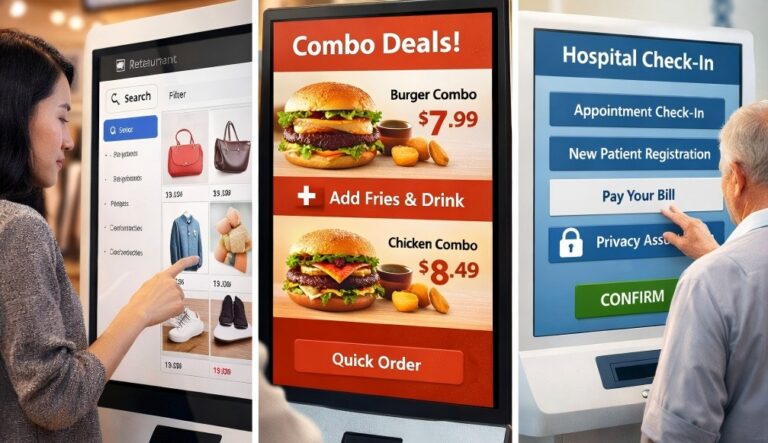
UI Design Requirements by Scenario: Retail, Restaurant, and Healthcare
After understanding the core principles of user-friendly touchscreen UI design, it’s important to recognize that different industries require very different approaches. The UI complexity and design priorities of a kiosk should always align with its real-world usage scenario.
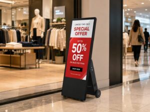
In retail environments, the focus is on product discovery and visual engagement. Since stores often have a large number of SKUs, the UI must support efficient search and filtering functions. At the same time, attractive layouts, high-quality images, and smart product recommendations help capture attention and increase purchase intent. A good retail kiosk UI balances exploration and speed, allowing users to browse comfortably while still guiding them toward checkout.
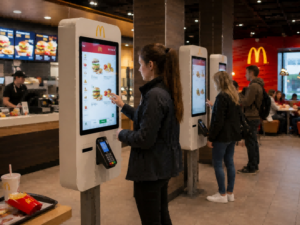
For restaurants, the priority shifts to speed and simplicity. Customers typically want to place orders quickly, especially during peak hours. This means the UI should follow an ultra-simplified flow, minimizing steps and avoiding unnecessary distractions. Clear menu categories, large food images, and quick customization options are key. In addition, well-placed upsell prompts—such as combo meals or add-ons—can increase order value without slowing down the process.
In healthcare display settings or solutions, such as hospitals or clinics, the UI must prioritize clarity, guidance, and trust. Users may already feel stressed or unfamiliar with the system, so the interface should provide step-by-step instructions with clear labels and confirmations. Features like appointment registration or payment require extra attention to privacy and accuracy, including confirmation screens to prevent mistakes.
Ultimately, different scenarios demand different UI strategies. A successful kiosk design is not one-size-fits-all—it adapts to user behavior, environment, and expectations to deliver the best possible experience.
Case Study: How Optimized UI Improved Kiosk Efficiency
After exploring how UI design varies by scenario, let’s look at a real-world example to understand how optimization can directly improve kiosk performance. A well-known case is McDonald’s, which has widely adopted self-service ordering kiosks across its global stores.
Before optimization, many early kiosk interfaces faced similar issues. The menu structure was overly complex, with too many layers and inconsistent category logic. Users often hesitated while browsing, and the ordering process required multiple steps that slowed things down. During peak hours, this led to long queues, increased staff intervention, and even abandoned orders.
To improve efficiency, McDonald’s redesigned its kiosk UI with a strong focus on simplicity and guidance. The menu was reorganized into clear, easy-to-navigate categories, allowing users to find items quickly. High-quality images and visual combo recommendations were introduced to highlight popular meals and upsell options. At the same time, the ordering flow was streamlined, reducing unnecessary steps and making it possible to complete an order in just a few taps.
The results were impressive. The average ordering time was significantly reduced, helping stores handle more customers during busy periods. In addition, the use of visual upselling strategies increased the average order value, as more users opted for meal upgrades. Most importantly, the improved interface led to higher customer satisfaction, with fewer errors and smoother interactions.
This example shows that a well-optimized kiosk UI is not just about design—it’s a powerful tool for improving efficiency, revenue, and overall user experience.
Custom UI Design with Kiosk OEM/ODM Solutions
As we’ve seen from different scenarios and case studies, UI design is not one-size-fits-all. To truly maximize kiosk performance, many businesses turn to OEM/ODM solutions, where both hardware and software—including the UI—are designed together from the ground up.
One of the biggest advantages of kiosk OEM/ODM customization is the deep integration between UI design and hardware configuration. Instead of adapting a generic interface to fit a device, manufacturers can optimize screen size, touch sensitivity, camera placement, and even processing power to support a smoother and more responsive UI experience. This results in better performance, especially in high-traffic or specialized environments.
Another key benefit is full brand customization. Businesses can tailor the interface style, color scheme, layout, and interaction logic to match their brand identity. Whether it’s a retail store aiming for a visually engaging shopping experience or a healthcare provider prioritizing clarity and trust, a custom UI ensures consistency across all customer touchpoints.
OEM/ODM solutions also allow for scenario-based UI optimization. For example, a retail kiosk can focus on product browsing and recommendations, a restaurant kiosk on fast ordering and upselling, and a hospital kiosk on step-by-step guidance and privacy protection. This level of customization ensures the UI aligns perfectly with user behavior and expectations in each setting.
Equally important is long-term support and scalability. A reliable OEM/ODM partner provides ongoing updates, system optimization, and technical support, ensuring the kiosk remains efficient as business needs evolve.
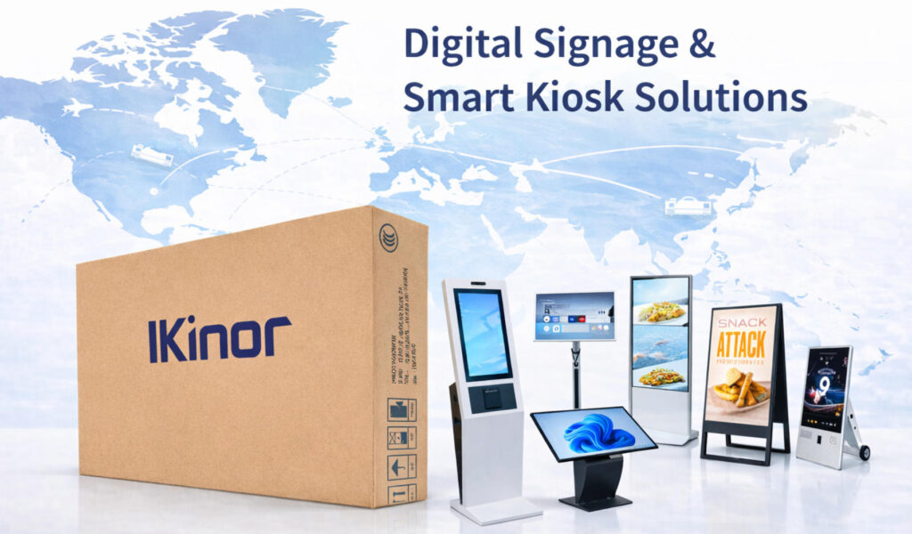
For businesses looking to build high-performance kiosks, Ikinor, a professional smart display and kiosk manufacturer, offers end-to-end OEM/ODM solutions—from hardware selection to custom UI development—helping you create user-friendly, scalable, and future-ready kiosk systems.
FAQs
A successful kiosk UI combines simplicity, clarity, and responsiveness. It should guide users naturally through tasks with minimal steps, using large buttons, clear visuals, and intuitive layouts.
Extremely important. Accessibility ensures that all customers—including those with visual, hearing, or physical impairments—can use the kiosk easily. This means incorporating features like high contrast, voice assistance, multi-language options, and reach-friendly controls.
Yes. Each use case has unique goals and user behaviors. Retail kiosks focus on browsing and purchasing, hospitality kiosks prioritize check-in and service requests, while information kiosks emphasize quick access to directions or details.
Through visual appeal and interaction flow. Elements such as animations, personalized content, and feedback messages make the experience enjoyable while boosting user confidence and retention.
Branding should be consistent but unobtrusive. Colors, logos, and typography must align with the brand identity while maintaining readability and usability across different screen sizes and lighting conditions.